Home > frontend > Website Performance: A Guide to Website Speed and Image Optimization.
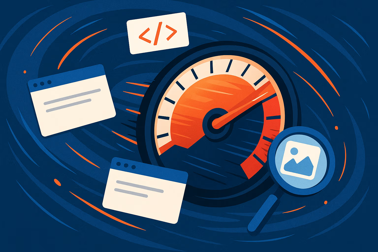
Website Performance: A Guide to Website Speed and Image Optimization.
Image optimization is one of the factors that can improve the overall performance of a website.
By :Thomas Inyang🕒 3 Jun 2025
Introduction
The long loading time of a webpage can be frustrating; like, when will the main webpage content show? Then your enthusiasm wanes with every passing second.
This concern has made fronted developers think of possible solutions to mitigate long load time because speed is not just a feature; it's a necessity.
While various factors contribute to frontend speed, there's one factor that's always overlooked, which is high-quality images with large sizes (bytes). An unoptimized image will surely affect a webpage's load time.
By the end of this post, you will be familiar with the following concepts that make a website load faster:
- What a website speed is.
- About image optimization and image formats.
- Image optimization techniques and tools.
- How to optimally render images in HTML and Next.js.
- What other ways are there to achieve website speed?
- SEO image optimization.
What is Frontend (Website) Speed?
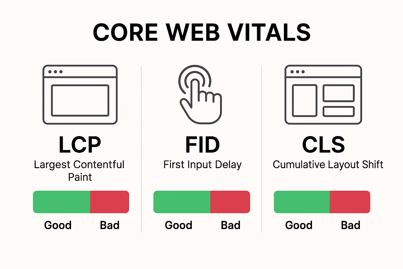
It is the overall responsiveness and loading efficiency of the client-side (browser) portion of a web application. The following metrics are used to measure a webpage's speed:
- Time to First Byte (TTFB): How long it takes a browser to receive the first byte of content from the server.
- First Contentful Paint (FCP): This measures the time from when the page starts loading to when its content is rendered on the screen.
- Largest Contentful Paint: The time duration it takes the largest content element (like a hero image or a large block of text) to become visible within the viewport.
- First Input Delay (FID): The amount of time it took a browser to respond to user interaction (e.g., clicks a button or taps a link).
- Cumulative Layout Shift (CLS): It measures the total of all unexpected layout shifts that occur during the loading phase.
- Total Blocking Time (TBT): This measures the total time between FCP and TTI (Time to Interactive) where the main thread is blocked for long enough to prevent input responsiveness.
Google uses these core web vitals for search result ranking.
About Image Optimization
It is the process of reducing the file size of your images while maintaining acceptable visual quality. This is crucial for web performance, SEO, and especially for users on mobile devices with limited bandwidth.
Categories of Web Image Formats.
1. Lossy Compression: These formats reduce file size by permanently discarding some image data the human eye is less likely to notice.
- JPEG (.jpg or .jpeg): Excellent for balancing quality and file size for complex photos.
- WebP (.webp): A modern format developed by Google. The file size is about 25-35% smaller than comparable JPEGs or PNGs at the same quality setting.
- AVIF (.avif): The cutting-edge format, based on the AV1 video codec. It is often smaller in file size, 30-50%, than WebP at similar quality.
See Also: How to Render Open Graph Image (og-image) in Next.js
2. Lossless Compression: Reduces file size without removing any image data, which makes it perfect for reconstruction from the compressed data.
- PNG (.png): Ideal for images with transparent backgrounds, logos, icons, or graphics with sharp edges and blocks of solid color. PNGs are generally larger than JPEGs for photographic content.
- GIF (.gif): Best suited for simple animations and small graphics with a limited color palette. Not recommended for photos due to large file sizes and limited color depth.
Meanwhile, there's no single "most optimal" format; it depends on the image content and your priorities.
Image Formats Comparison.
- WebP vs. PNG: For images requiring transparency (logos, icons), WebP is almost always superior to PNG in terms of file size while retaining quality. For photographic content, WebP often beats JPEG.
- AVIF format: While AVIF offers superior compression, its browser support is still catching up. You might use AVIF with WebP and JPEG/PNG as fallbacks.
- Best Image Setting for Websites: Prioritize WebP and AVIF for modern browsers, and provide JPEGs/PNGs as fallbacks. Use JPEGs for photographs, PNGs for transparent graphics, and GIFs only for simple animations.
How to Make Sure an Image is High-Resolution?
For web image rendering, "high resolution" images have enough pixels to look sharp on modern screens with a pixel density of 2x or 3x for Retina displays. Don't waste users' bandwidth by uploading images that are 4000px wide; they'll only display at 800px. Instead, provide appropriately sized images for different screen sizes.
Practical Image Optimization Techniques:
1. Resizing Images:
- Always serve images at the maximum size they will be displayed. If your blog post image will only ever be 800px wide, don't upload a 2500px wide image.
- For mobile, you might need even smaller versions of your images.
2. Compression Strategies:
- Use image editing software (Photoshop, GIMP, Cloudinary) or online tools to export JPEGs with a quality setting of 60-80%.
- Lossless Compression: Tools like CloudinaryTools, TinyPNG/TinyJPG, Squoosh.app (Google's excellent web app), or desktop applications (like ImageOptim for Mac) can perform lossless compression.
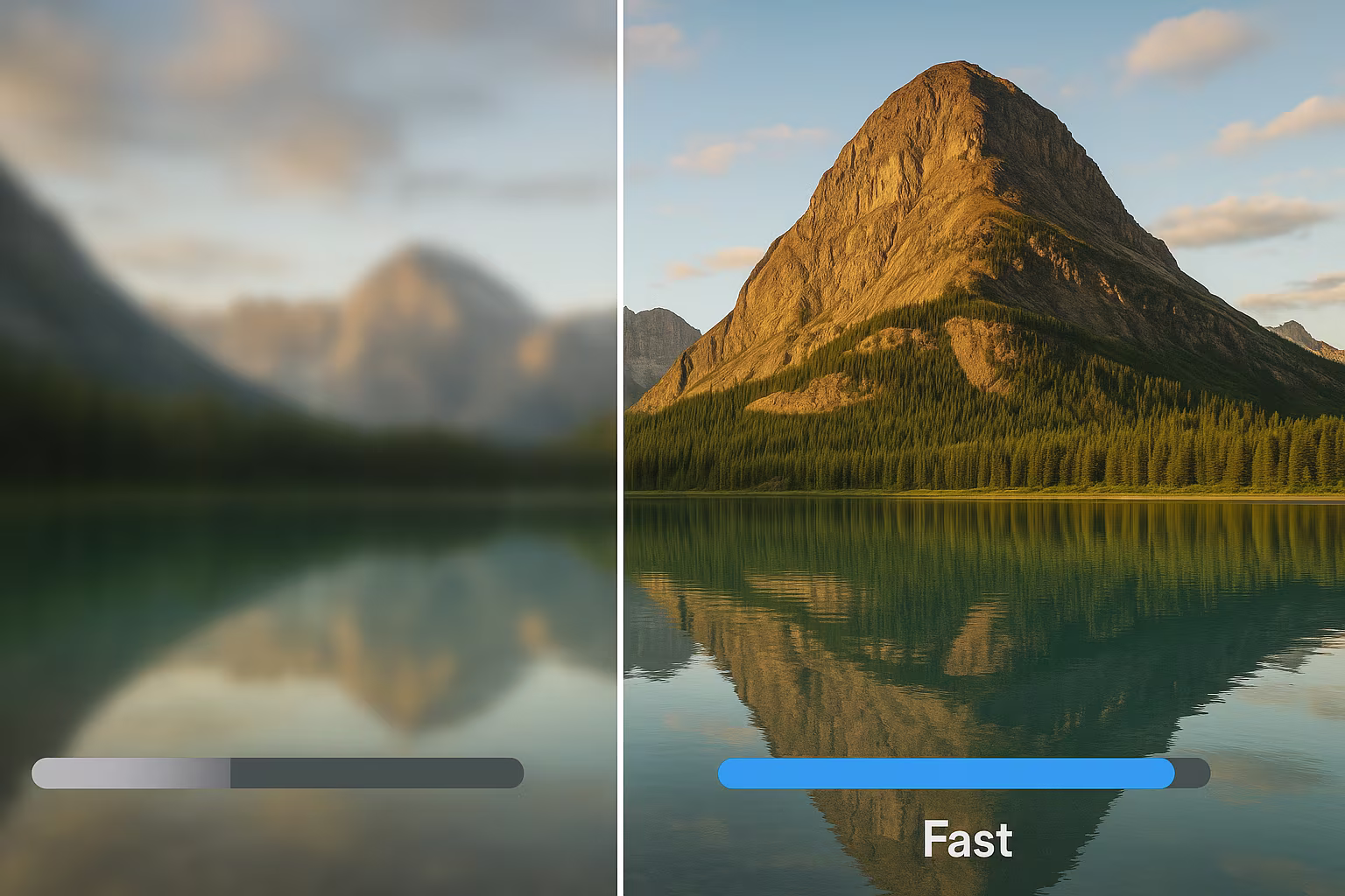
3. Lazy Loading Images:
The simplest way to implement this is with the loading="lazy" attribute on your <img> tag.
See Also: Responsive Web Design: From Basics to Implementation.
4. Responsive Images (Srcset & Sizes):
- The srcset attribute specifies a list of different image files along with their intrinsic widths, letting the browser pick the most appropriate one.
- How to optimize photos for mobile effectively involves using srcset and sizes to ensure mobile users aren't downloading desktop-sized images.
5. Image CDNs & Optimization Services:
These services dynamically optimize and serve images from geographically distributed servers.
6. Cloudinary:
How to use Cloudinary to convert image format: You upload a single high-resolution image and choose how you want it to be in any format (WebP, AVIF, JPEG), resized, cropped, or with various effects, simply by changing the URL parameters.
How to Optimize Images With The Next.js Image Component.
You can optimize images in Next.js this way.
This code uses Tailwind for styling, and the following was done in the code:
- h-[320px] h-[240px] - Uses Tailwind CSS for responsive height: 320px on mobile, full height on medium screens and up.
- overflow-hidden - Hides any content that extends beyond the container boundaries.
- relative - Sets positioning context for the positioned image.
- rounded - Applies border radius for rounded corners.
- src - Points to an AVIF image file of a gradient mobile isometric technology background.
- alt="normal" - Alt text for accessibility (though "normal" isn't very descriptive)
- fill - Makes the image fill its parent container completely.
- sizes - Responsive sizing hints: 50% viewport width for screens 320px+, otherwise 75% viewport width.
- objectFit: "cover" - Scales the image to cover the entire container while maintaining the aspect ratio (may crop parts of the image).
- priority={true} - Tells Next.js to prioritize loading this image (useful for above-the-fold content).
See Also: How to Load External Image Source in Next.js Image Component.
Why use Next.js Image component? It automatically optimizes images for performance by providing lazy loading, format conversion, responsive sizing, and built-in optimization features that significantly improve page load times and user experience.
How to Optimize Images in HTML
- Use the <img> tag with width, height (to prevent CLS), and loading="lazy."
- The <picture> element allows you to provide multiple source elements for different image formats and resolutions, ensuring the browser picks the best one. This is crucial for supporting AVIF/WebP with fallbacks.
- srcset and sizes attributes for responsive images are vital for how to optimize images for web performance in HTML.
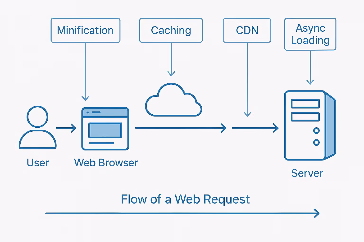
Other Ways to Achieve Website Speed.
1. Code Optimization
- Use build tools to remove unnecessary characters from HTML, CSS, and JavaScript.
- Server-side Brotli/Gzip compression reduces transfer sizes.
- Use async/defer attributes and inline critical CSS to prevent render blocking
2. Caching & Delivery
- Browser Caching: HTTP headers enable local asset storage for faster repeat visits
- Service Workers: Background scripts provide advanced caching and offline capabilities
- CDNs: Cloudflare's free tier offers global asset distribution with security features
3. Rendering Strategies
- SSR: Server-generated HTML improves initial paint metrics
- SSG: Pre-built static pages enable fastest CDN delivery
- Frameworks: Next.js provides integrated SSR/SSG with React
4. Mobile Optimization
Implement responsive design with optimized touch targets, selective scripts, and proper image sizing (srcset/sizes). Test on actual devices across network conditions.
SEO Image Optimization
Key Elements for Image SEO:
- Make alt text (alternative text) descriptive and include relevant keywords naturally. It describes the image to visually impaired users and to search engines. E.g <img src="mountain-bike.jpg" alt="Person riding a red mountain bike on a forest trail">
- Use descriptive, keyword-rich file names before uploading. Avoid generic names like IMG001.jpg. Instead, use red-mountain-bike-forest.jpg.
- Which image URL is best suited for image SEO? Clean, descriptive URLs that reflect the image content are best. Avoid long, cryptic strings.
- For specific contexts like product images (e.g., using Schema.org markup), structured data can help Google understand the image's context and display it.
Conclusion
In this post, you’ve read why speed matters in web development.
Remember, optimization isn't a one-time fix; it’s a continuous process. Monitor your site's performance regularly, and apply the strategies outlined in this guide.
Don't let slow loading times be the reason users leave your site. Start implementing these changes today, measure the impact, and watch your user experience and SEO rankings soar. Your users (and Google) will thank you for it!
Please Share