Home > frontend > Responsive Web Design: From Basics to Implementation.
Responsive Web Design: From Basics to Implementation.
If your website isn't responsive, you're losing customers, revenue, and search rankings without even knowing it.
By :Thomas Inyang🕒 24 May 2025
Introduction
A potential customer finds your business through a Google search while going through their smartphone. They tap your link with anticipation, but instead of a smooth browsing experience, they're greeted with tiny text, misaligned buttons, and horizontal scrolling. Within three seconds, they've hit the back button and chosen your competitor instead.
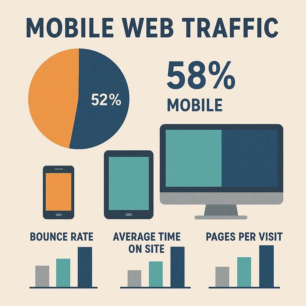
This situation occurs millions of times every day, and you are unknowingly losing clients, money, and search engine rankings if your website is not responsive. A responsive website is not only advised but necessary for surviving in the modern digital environment, as mobile devices now account for more than 58% of all web traffic worldwide.
What you'll discover in this guide:
- The fundamental principles that separate great responsive websites from mediocre ones
- Step-by-step methods to convert any existing website to fully responsive
- Professional testing techniques to ensure your site works flawlessly across all devices
- Performance optimization strategies that make your responsive site lightning-fast
- Expert insights on avoiding common pitfalls that cost businesses thousands in lost revenue
Regardless of your background—web designer, developer, or business owner—this thorough guide will revolutionize your knowledge of responsive design and equip you with the useful skills you need to produce outstanding user experiences on all platforms.
Understanding Responsive Web Design
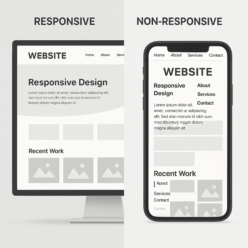
Responsive web design is a web development approach that creates dynamic changes to a website's appearance based on the screen size, platform, and orientation of the device being used to view it.
If you think of responsive design as your website's chameleon, it will automatically adjust its layout, images, and functionality to give users the best possible viewing experience whether they are using a 5-inch smartphone screen or a 27-inch desktop monitor.
The concept emerged in 2010 when web designer Ethan Marcotte coined the term, but it wasn't until mobile internet usage exploded that responsive design became critical. Today's users expect websites to work seamlessly regardless of how they access them, and search engines like Google have made mobile-friendliness a crucial ranking factor.
Why Your Website Must Be Responsive in 2025
The statistics are staggering: mobile devices account for over half of all web traffic, and this number continues climbing. But beyond the numbers lies a fundamental shift in user behavior. Modern consumers research, shop, and make decisions on the go, often switching between devices throughout their customer journey.
Google's mobile-first indexing means the search engine primarily uses your website's mobile version for indexing and ranking. If your site isn't responsive, you're not just losing visitors—you're losing visibility in search results entirely.
Business Impact Reality Check:
- 53% of mobile users abandon sites that take longer than 3 seconds to load.
- 67% of users are more likely to purchase from mobile-friendly sites.
- Non-responsive websites can lose up to 40% of potential customers.
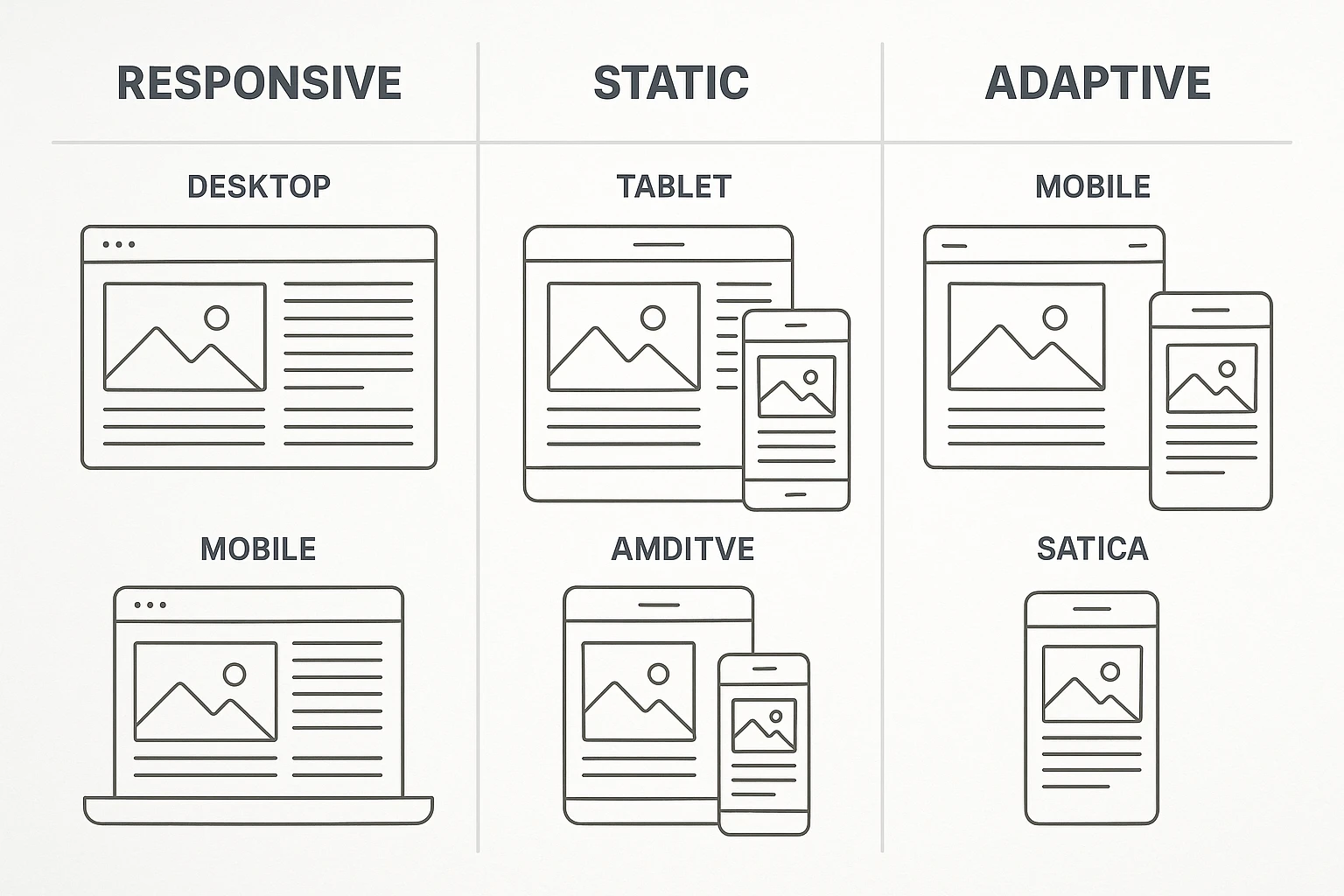
Responsive vs. Other Design Approaches
Mobile-friendly design ensures content is accessible on mobile devices, while responsive design automatically adjusts layout and functionality across all screen sizes using flexible grids and media queries.
It's important to comprehend the variety of design approaches that are currently available before beginning implementation. Terms like "responsive," "mobile-friendly," and "adaptive" can cause confusion for many business owners, but they can have a big impact on the upkeep and functionality of your website.
Responsive Design vs. Mobile-Friendly Design
Simply put, mobile-friendly design ensures that your website works well on mobile devices without experiencing significant lag. But this frequently means that users must pinch, zoom, and scroll horizontally, which isn't exactly a high-end user experience. Conversely, responsive design ensures optimal usability by rearranging content specifically for each screen size.
Real-world example: A mobile-friendly site might display your full desktop navigation menu in tiny text on mobile, while a responsive site would convert that same menu into a hamburger icon with touch-friendly dropdown options.
Responsive vs. Adaptive Design
Adaptive design loads a pre-made layout for that particular screen size after identifying the user's device. Creating and maintaining multiple versions of your website is necessary, but it can give you more control over the user experience. Responsive design requires more complex initial planning but requires less maintenance thanks to its use of fluid grids and flexible elements that adapt automatically.
See Also: When to use a Component-Based, Tailwind, or CSS-Based Styling Approach.
When to choose adaptive: Large e-commerce sites with complex functionality often benefit from adaptive approaches for critical pages like checkout flows.
When to choose responsive: Most businesses benefit from responsive design's efficiency and Google's preference for single-URL responsive sites.
Static vs. Responsive Websites
Static websites display the same content and layout regardless of the viewing device. While simpler to create initially, they provide poor user experiences on mobile devices and hurt your search engine rankings. The maintenance headache of managing separate mobile sites makes responsive design the clear winner for long-term sustainability.
Knowing these distinctions enables you to choose your website strategy with knowledge. For the majority of applications, responsive design is the most adaptable and future-proof option due to its technical underpinnings, as we'll discuss next.
The Three Pillars of Responsive Design
The three pillars of responsive design are flexible grid systems (layouts that adapt to screen size), fluid images and media (content that scales proportionally), and CSS media queries (rules that apply different styles based on device characteristics). Understanding these concepts will help you communicate effectively with developers and make informed decisions about your website's architecture.
Pillar 1: Flexible Grid Systems
Traditional websites use fixed pixel widths—a 960-pixel-wide container might look perfect on desktop but creates horizontal scrolling nightmares on mobile. Flexible grids use percentages and relative units instead of fixed pixels, allowing content to flow naturally across different screen sizes.
Modern CSS Grid and Flexbox technologies make creating these flexible layouts more intuitive than ever. Instead of fighting with floating elements and complex calculations, developers can now create sophisticated layouts that automatically adjust to their containers.
Practical example: Instead of setting a sidebar to exactly 300 pixels wide, a responsive approach might set it to 25% of the container width, ensuring it always maintains proper proportions regardless of screen size.
Pillar 2: Fluid Images and Media
Images and videos can easily break responsive layouts if not handled properly. Fluid media scales proportionally with the surrounding content, preventing overflow issues and maintaining visual hierarchy across devices.
Modern responsive image techniques go beyond simple scaling. They include serving different image sizes based on screen resolution (using srcset attributes) and art direction (using picture elements) to optimize both performance and visual impact.
See Also: How to Load External Image Source on NextJS Image Component.
Performance consideration: A responsive image strategy can reduce mobile page load times by up to 50% by serving appropriately sized images instead of forcing mobile users to download massive desktop-sized files.
Pillar 3: CSS Media Queries
Media queries are the conditional logic of responsive design, allowing different CSS rules to apply based on screen size, resolution, and even user preferences. They're the mechanism that transforms your flexible grid and fluid images into truly responsive experiences.
Strategic breakpoint planning is crucial here. Rather than designing for specific devices, successful responsive designs focus on content breakpoints—points where the content naturally needs to reorganize for optimal readability and usability.
See Also: How to Implement Og-Image in NextJS.
Together, these three pillars produce websites that seem thoughtfully made for all screen sizes. However, technical implementation alone is not enough to determine whether your responsive site actually meets the needs of your users; strategic planning is essential.
Strategic Planning: Mobile-First vs. Desktop-First Approaches
Mobile-first design starts with the smallest screen size and progressively enhances the experience for larger screens, while desktop-first design begins with full-featured desktop layouts and then simplifies for smaller screens.
Choosing between mobile-first and desktop-first approaches isn't just a technical decision—it's a strategic choice that affects everything from performance to user experience to development efficiency.
The Mobile-First Advantage
Mobile-first design has gained popularity because it forces designers and developers to prioritize content and functionality. When you start with the constraints of a small screen, you naturally focus on what's most important to your users. This results in cleaner, more focused designs that perform better across all devices.
Performance benefits: The base styles are optimized for the most resource-constrained environment, with improvements layered on for devices that can handle them, so mobile-first CSS usually leads to faster loading times.
Content strategy benefits: Even on desktop, starting mobile-first frequently improves user experiences by forcing you to make difficult choices about content hierarchy early in the design process.
When Desktop-First Makes Sense
Despite mobile-first's advantages, desktop-first approaches still have their place, particularly for:
- Complex web applications with extensive functionality
- B2B software where desktop usage dominates
- Data-heavy interfaces that benefit from larger screen real estate or building e-commerce websites.
- Legacy system updates where mobile-first would require complete architecture overhauls
Implementation Strategy
Whichever strategy you decide on, considering user journeys across devices is essential to effective responsive design. A user might research on mobile during lunch, compare options on a tablet at home, and make a purchase on a desktop at work. Your responsive design should support this multi-device journey seamlessly.
Key planning considerations:
- Identify your primary user scenarios for each device type
- Map out critical user actions and ensure they're equally accessible across all breakpoints
- Plan for content that might be secondary on mobile but primary on desktop (and vice versa)
- Consider how forms, navigation, and calls-to-action need to adapt
The practical implementation phase, where theory meets reality and your responsive design comes to life, is where this strategic foundation gets you ready.
How to Convert Your Existing Website to Responsive
The process of redesigning non-responsive websites so that their layout, graphics, and functionality automatically adjust to all screen sizes and devices is known as responsive design conversion.
If you already have a website that isn't responsive, don't panic—conversion is absolutely possible and often more cost-effective than starting from scratch. However, successful conversion requires systematic planning and execution to avoid common pitfalls that can harm your search rankings or user experience.
Assessment and Planning Phase
Perform a thorough audit of your current website before modifying a single line of code. This entails examining your present traffic trends, determining which pages generate the greatest value for your company, and comprehending how users currently engage with your website on mobile devices.
Critical assessment questions:
- Which pages have the highest bounce rates on mobile devices?
- What percentage of your traffic already comes from mobile users?
- Which conversion funnels are most impacted by poor mobile experience?
- Are there third-party integrations that might complicate responsive conversion?
Use tools like Google Analytics to understand your mobile user behavior patterns. You might discover that mobile users interact with your site differently than desktop users, requiring strategic content reorganization beyond just layout changes.
Step-by-Step Conversion Process
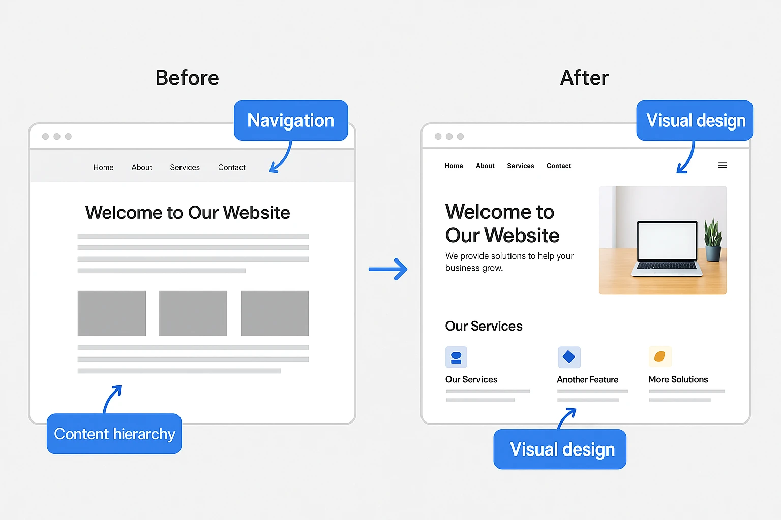
Phase 1: Infrastructure Preparation Start by creating your CSS media query structure and putting the viewport meta tag into practice. This lays the groundwork for responsive behavior without requiring a quick change to your visual style.
Phase 2: Content Prioritization Determine which aspects of the content are necessary for mobile users and which are optional for desktop users. The goal here is progressive disclosure and strategic reorganization, not content removal.
Phase 3: Layout Restructuring Convert fixed-width layouts to flexible grids, starting with your main content areas and working outward to secondary elements. This phase often reveals content hierarchy issues that existed in your original design.
Phase 4: Navigation Optimization Transform desktop navigation systems into mobile-friendly alternatives. Implementing accordion-style dropdowns, hamburger menus, or a total overhaul of your information architecture may be necessary to achieve this.
Phase 5: Form and Interaction Enhancement Optimize forms for touch input, ensure buttons are appropriately sized for finger taps, and implement mobile-specific UI patterns where beneficial.
Common Conversion Challenges and Solutions
Large, fixed-size images that look fantastic on desktop computers but use a lot of bandwidth on mobile devices are a common feature of existing websites. For improved compression, use responsive image solutions and think about utilizing contemporary image formats like WebP.
Third-Party Integration Problems: Embedded maps, social media widgets, and other third-party elements frequently break responsive layouts. Plan for these integrations early and have fallback solutions ready.
Performance Degradation: Converted sites sometimes perform worse than the original because responsive CSS adds complexity. Implement performance monitoring and optimization from the beginning of your conversion process.
Although the conversion process may appear daunting, it can be controlled, and the risks to your current online presence are reduced by segmenting it into methodical stages.
Testing and Optimization Your Website
Responsive website testing involves checking how your website performs across different devices, browsers, and network conditions to ensure consistent functionality and optimal user experience.
Building a responsive website is only half the battle—rigorous testing ensures your design works flawlessly in the real world, where users access your site through countless device and browser combinations.
Comprehensive Testing Strategy
Automated Testing Tools Google's Mobile-Friendly Test provides a quick baseline assessment, but comprehensive testing requires more sophisticated tools. BrowserStack and similar services allow you to test your website on real devices without maintaining a physical device lab.
Key automated testing priorities:
- Cross-browser compatibility across major browsers and versions
- Performance testing under different network conditions
- Accessibility compliance for users with disabilities
- SEO impact assessment, including Core Web Vitals scores
Manual Testing Methodology Automated tools can't capture the nuanced user experience issues that real human testing reveals. Develop a systematic manual testing process that covers:
- Navigation usability across different screen sizes
- Form completion workflows on touch devices
- Content readability and visual hierarchy effectiveness
- Loading speed perception under various conditions
Performance Optimization for Responsive Sites
Responsive websites can easily become performance bottlenecks if not optimized properly. The same site needs to deliver excellent experiences on both high-end desktop computers and budget smartphones with limited processing power.
Image Optimization Strategy Implement responsive image techniques that serve appropriate file sizes based on device capabilities. This single optimization can reduce mobile page load times by 40-60% while maintaining visual quality.
Critical Path Optimization Prioritize loading the bare minimum of CSS and JavaScript needed for above-the-fold content to render. Even though it takes longer for the entire page to load, this gives the impression that it is loading more quickly.
Progressive Enhancement Implementation Create a responsive website that uses only the most basic HTML and CSS, then add JavaScript features for devices and browsers that support them. This guarantees universal accessibility while, when feasible, offering rich experiences.
Real-World Testing Scenarios
Network Condition Testing Test your responsive site under various network conditions, including slow 3G connections that many mobile users still experience. What feels fast on your office WiFi might be unusably slow for actual customers.
User Journey Testing: Test complete user workflows, not just individual pages. A responsive contact form might work perfectly in isolation but break when accessed from your responsive navigation menu.
Professional responsive designs are distinguished from amateur attempts by rigorous testing and optimization. Your business outcomes and user satisfaction are directly impacted by this attention to detail.
Advanced Techniques and Future-Proofing
Advanced responsive techniques involve using cutting-edge CSS features, performance optimization methods, and emerging technologies to create superior user experiences that adapt to future devices and user needs.
As responsive design has matured, advanced techniques have emerged that go beyond basic layout adaptation to create truly exceptional user experiences. Understanding these techniques helps you stay ahead of the curve and prepare for future technological developments.
Modern CSS Features for Enhanced Responsiveness
Container Queries Revolution Container queries react to the size of particular elements, whereas media queries react to the size of the viewport. This makes it possible for responsive design to be more modular and component-based so that elements can be used anywhere on the page.
Fluid Typography and Spacing The CSS clamp() function enables typography and spacing that scales smoothly between minimum and maximum values, eliminating the need for multiple breakpoint-specific declarations while creating more polished visual experiences.
Custom Properties for Responsive Systems CSS custom properties (variables) allow you to create responsive design systems that can be easily maintained and modified. This approach makes it simple to adjust spacing, colors, and sizing across your entire responsive design from a central location.
Performance and User Experience Enhancements
Progressive Loading Strategies Use advanced loading techniques that lazy-load elements below the fold and give priority to visible content. This saves bandwidth for mobile users while giving the impression that the page loads instantly.
Touch and Gesture Optimization Beyond simply making things finger-friendly, modern responsive designs incorporate complex touch interactions that stay usable by mouse and keyboard users while feeling responsive and natural on mobile devices.
Preparing for Future Devices
The responsive design principles you implement today need to work on devices that don't exist yet. Foldable phones, smart TVs, automotive displays, and augmented reality interfaces all present new challenges that well-architected responsive systems can handle.
Future-Proofing Strategies:
- Design with device-agnostic interaction patterns
- Implement accessibility features that work across input methods
- Create modular design systems that can be recombined for new contexts
- Plan for variable screen ratios and orientations beyond traditional landscape/portrait
These advanced techniques transform responsive design from a technical requirement into a competitive advantage, setting your website apart in an increasingly crowded digital landscape.
Measuring Success and Business Impact
To determine the return on investment (ROI) of responsive design investments, it is necessary to monitor key performance indicators such as mobile conversion rates, search rankings, user engagement metrics, and business outcomes. The right metrics help you understand not just what's working but why it's working and how to improve further.
Key Performance Indicators for Responsive Success
User Experience Metrics
- Mobile bounce rate reduction compared to pre-responsive baseline
- Time-on-site improvements across different device categories
- Conversion rate optimization across the complete responsive funnel
- User satisfaction scores from surveys and feedback tools
Technical Performance Indicators
- Core Web Vitals scores across all device types and network conditions
- Page load speed improvements, particularly on mobile networks
- Search engine ranking improvements following responsive implementation
- Organic traffic growth from mobile search queries
Business Impact Analysis
The most captivating success stories for responsive design relate tangible business results to technological advancements. Track revenue attribution across devices to understand how responsive design affects your bottom line.
Revenue and Conversion Tracking Many businesses discover that improved mobile experiences don't just increase mobile conversions—they improve overall conversion rates as users become more likely to complete transactions they research on mobile devices.
Cost Savings Assessment Responsive design often reduces long-term maintenance costs by eliminating the need to maintain separate mobile sites. Calculate these savings alongside the revenue improvements for a complete ROI picture.
Continuous Improvement Strategy
Responsive design is a continuous optimization opportunity rather than a one-time endeavor. To evaluate performance data and find areas for improvement, set up regular review cycles.
A/B testing can be used to improve responsive design components, especially for important conversion points like contact forms and checkout procedures. In the long run, minor enhancements to the mobile user experience can have a big impact on business.
Conclusion
From a desirable feature to a vital business requirement, responsive web design has changed over time. There is no denying the overwhelming evidence that websites that fail to deliver exceptional user experiences across all devices lose clients, search engine rankings, and income to rivals who do.
Your immediate next steps:
- Test your current website using Google's Mobile-Friendly Test and real mobile devices.
- Analyze your mobile traffic and conversion data to understand the current impact.
- Prioritize which pages need responsive improvements first based on business value.
- Choose between conversion and rebuild based on your site's current state and business goals.
- Implement comprehensive testing and performance monitoring from day one.
The field of responsive design is constantly changing as new CSS features, device types, and user expectations appear on a regular basis. But the core ideas we've discussed—user-centered design, fluid media, flexible layouts, and strategic breakpoints—remain the same.
The key to success in responsive design is realizing that designing for smaller screens isn't the only goal. It's about making experiences that seem like they were thoughtfully designed for every device while keeping your business goals and brand consistent across all touchpoints.
Remember that your responsive website often serves as the basis for a prospective customer's initial impression of your business. Make it matter by developing experiences that actively support both customer satisfaction and business growth in addition to operating flawlessly across all devices.
Your investment in responsive design now will pay off in the form of higher search engine rankings, more conversions, and happy clients who can interact with your company on any device, at any time, and from any location.
Please Share