Home > frontend > CSS Pseudo-Classes and Pseudo-Elements Explained
CSS Pseudo-Classes and Pseudo-Elements Explained
These are CSS selectors that target specific states or parts of HTML elements without requiring extra markup.
By :Thomas Inyang🕒 22 May 2025

Introduction
Aside from creating slick hover effects, managing focus states, or adding decorative elements without cluttering the HTML, Pseudo Class and Elements are FAQs during web development interviews.
As a front-end developer, you should not only know the concepts of these CSS attributes but also know how they are used while building responsive, accessible websites. This blog will do justice to both concerns.
At the end of this post, you'll have a better understanding of the following:
- The fundamental differences between pseudo-classes and pseudo-elements
- How to implement interactive states like hover and focus
- Advanced selector techniques using modern CSS
- Practical applications and creative solutions for common design challenges
- Best practices for accessibility and performance
Let's dive into the world of CSS pseudo-selectors and unlock new possibilities for your web projects!
What are pseudo-classes and pseudo-elements in CSS?
These are CSS selectors that target specific states or parts of HTML elements without requiring extra markup by focusing on particular states or portions of HTML elements.
Think about it this way: when you need to style a link differently when someone hovers over it or when you want to add a decorative element before a heading without modifying your HTML. That's where pseudo-classes and pseudo-elements come into play. They're special selectors that extend CSS's capabilities beyond what traditional class and ID selectors can achieve.
What is The Difference Between a Pseudo Class and Pseudo Element?
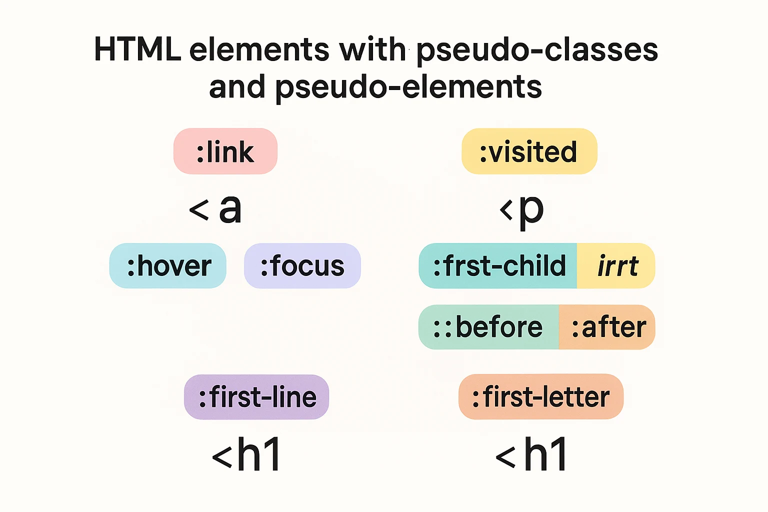
The fundamental distinction between these two is what they target: Pseudo-classes select elements based on their state or position in the document. They use a single colon (`:`) syntax, like `:hover` or `:first-child`. While Pseudo-elements target specific parts of an element rather than the whole element. They use a double colon (`::`) syntax, like `::before` or `::first-letter`.
The simplest way to remember is that pseudo-classes target whole elements in specific states, while pseudo-elements target parts of elements.
See Also: The Styling Approach to Use For Your Application
If you're reviewing older code, you might notice pseudo-elements sometimes written with a single colon. This was the original syntax in CSS2, but CSS3 introduced the double-colon notation to distinguish between pseudo-classes and pseudo-elements. For backward compatibility, browsers still support the single-colon syntax for older pseudo-elements, but the double-colon is the modern standard.
```css
Real-World Applications of Pseudo Class and Pseudo Element?
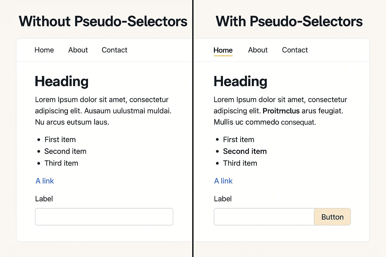
Pseudo-selectors solve many common design challenges, such as the following:
- - Highlight interactive elements when users hover over them
- - Style form fields based on their validation state
- - Add decorative elements without bloating the HTML
- - Create sophisticated UI components with minimal markup
Understanding these concepts isn't just academic—it's about writing cleaner, more maintainable code that separates presentation from structure, a core principle of modern web development.
What are the common pseudo-classes?
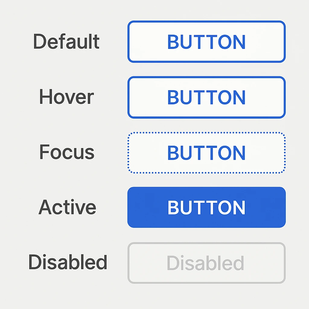
Interactive pseudo-classes like `:hover`, `:focus`, and `:active` detect user interactions with elements, enabling responsive design patterns without JavaScript. They allow elements to change in appearance by providing visual feedback that enhances usability.
The Hover Pseudo-Class
This class is triggered when a user positions their pointer over an element. It's commonly used to create interactive effects on links, buttons, and other clickable elements. To be clear, `:hover` is a pseudo-class, not a pseudo-element, as it selects the entire element in a specific state rather than part of it.
css
The Focus Pseudo-Class
While `:hover` responds to mouse interaction, `:focus` is triggered when an element receives focus, typically through keyboard navigation or programmatic focus. It therefore applies styles to an element when it becomes the active element on the page—for example when a user tabs to a form field or button.
While hover responds to mouse positioning, focus is about keyboard navigation and accessibility. A user can focus on elements by tabbing through the page, making focus states critical for accessibility.
```css
See Also: Why CRA (Create React App) Was Deprecated.
For users with mobility impairments or those who prefer keyboard navigation, what focus mode means is the difference between being able to use your website or not. A well-designed focus state should have the following attributes:
- Clearly visible with good contrast
- Consistently applied across interactive elements
- Distinct from hover states to avoid confusion
Other Related Interactive States
Beyond hover and focus, there are several other important interactive pseudo-classes:
- `:active` - Triggered when an element is being activated (like a button being clicked).
- `:visited` - Applied to links that have been visited according to the browser history.
- `:link` - Targets unvisited links.
- `:enabled` and `:disabled` - Target form elements based on their enabled/disabled state.
Each of these fulfills a specific role in creating intuitive interactive experiences.
Accessibility Considerations
Creating accessible interactive states goes beyond aesthetics—it's about ensuring your site is usable for everyone. One crucial technique is implementing skip navigation links, which allow keyboard users to bypass repetitive navigation menus that would otherwise require many tab presses to navigate through.
Browse mode allows users to review content, while focus mode enables interaction with controls like form fields and buttons.
Advanced Pseudo-Class Selectors and Combinations
Modern CSS offers powerful pseudo-class selectors like `:has()`, `:root`, and `:required` that enable sophisticated selection patterns and parent-child relationships.
As your CSS skills advance, you'll discover more powerful pseudo-classes that can handle complex selection logic and state management. These advanced selectors can dramatically reduce the need for helper classes and JavaScript.
The :has() Relational Pseudo-Class
This is one of the most exciting additions to modern CSS; it gives developers a native parent selector capability. Also, ‘:has()’ selects elements that contain at least one element that matches the selector provided as an argument. It's essentially a "parent selector" that many CSS developers have wanted for years.
```css
This powerful selector enables contextual styling that was previously impossible without JavaScript. It's now supported in all major browsers, opening up new possibilities for responsive design patterns.
Form-Related Pseudo-Classes
This has its own set of specialized pseudo-classes that make creating intuitive forms much easier. The `:required` pseudo-class targets form elements that have the `required` attribute set, allowing you to visually distinguish required fields from optional ones.
```css
These selectors enable you to create more intuitive forms that provide immediate feedback, improving the user experience without requiring JavaScript validation.
Structural Pseudo-Classes
This is used to select elements based on their position in the document tree or in relation to siblings. The `:root` pseudo-class targets the root element of the document (the `<html>` element in HTML). It's commonly used for declaring global CSS variables.
```css
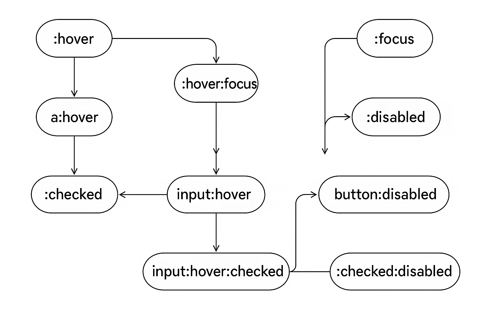
Combining Pseudo-Classes
A common question developers ask is, "Can pseudo-elements and pseudo-classes be combined?" Yes, they absolutely can! You can also chain multiple pseudo-classes together to create very specific selection patterns and more specific selectors. The order doesn't matter, but they all must be true for the styles to apply.
```css
CSS Techniques: Multiple Classes, Tooltips, and Z-index
CSS offers various techniques for element styling, including multiple class application, tooltips, and stacking contexts through z-index.
While pseudo-classes and pseudo-elements form a critical part of your CSS toolkit, they work best when combined with other CSS techniques. Let's explore some related concepts that complement your pseudo-selector knowledge.
Working with Multiple CSS Classes
Any number of elements can share the same class. Similarly, a single element can have multiple classes by separating them with spaces in the HTML:
In your CSS, you can target elements with specific class combinations:
```css
How to Create Tooltips with CSS
One practical application of pseudo-elements is creating tooltips—small informational pop-ups that appear when users hover over an element.
```css
Then in your HTML:
This approach is clean and maintainable, keeping your content and presentation separate.
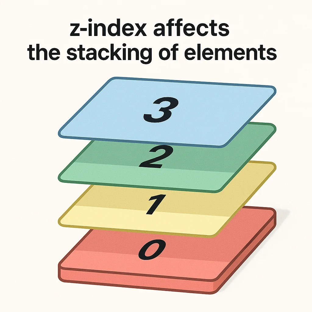
What is Z-index and its Stacking Contexts?
When working with overlapping elements like tooltips, dropdown menus, or modal dialogs, understanding z-index becomes critical. The `z-index` property determines the stacking order of positioned elements (elements with a position value other than `static`). Higher z-index values appear on top of elements with lower values.
See Also: How to Use Isometric Icons In Your Web App
```css
The key to managing z-index effectively is to use it sparingly and consistently, preferably with a system of predefined values for different types of UI components.
Other Important CSS Properties
Effects like blur can add depth and focus to your designs: The `blur()` function is part of the CSS `filter` property that applies a Gaussian blur to an element:
```css
When these effects are combined with pseudo-classes, they can create sophisticated UI components that respond to user interaction in meaningful ways.
What are The Creative Applications of Pseudo-Elements
Pseudo-elements unlock creative styling possibilities that would otherwise require additional markup:
```css
Limitations and Best Practices of Pseudo Elements
While powerful, pseudo-elements do have limitations:
- The content they generate isn't part of the DOM and can't be selected by users
- They can't be targeted by JavaScript directly
- Screen readers may handle generated content differently
- Complex interactive elements should typically use real HTML elements for accessibility
For accessibility, remember that decorative content added via `::before` and `::after` should be purely presentational. Any essential content should be in the HTML itself.
Conclusion
We've covered a lot of ground in this guide to CSS pseudo-classes and pseudo-elements! From basic interactive states to advanced selection techniques, these powerful CSS features enable you to create sophisticated, interactive, and accessible web interfaces with cleaner HTML and more maintainable code.
Here's a quick recap of what we've learned:
1. Pseudo-classes select elements based on state or position using a single colon (`:`) syntax.
2. Pseudo-elements target specific parts of elements using a double colon (`::`) syntax.
3. Interactive states like `:hover` and `:focus` are essential for creating responsive, accessible interfaces.
4. Advanced selectors like `:has()` enable powerful parent-child relationships.
5. Combining techniques creates sophisticated styling with minimal markup.
By mastering these concepts, you'll write more efficient CSS, create more interactive interfaces, and build more maintainable web projects.
Remember that the best CSS is not just about making things look good—it's about creating interfaces that are intuitive, accessible, and performant. Pseudo-selectors are powerful tools to achieve these goals when used thoughtfully.
What CSS pseudo-selector tricks have you discovered? How do you use them in your projects? Share your experiences in the comments below, and happy coding!
Please Share